
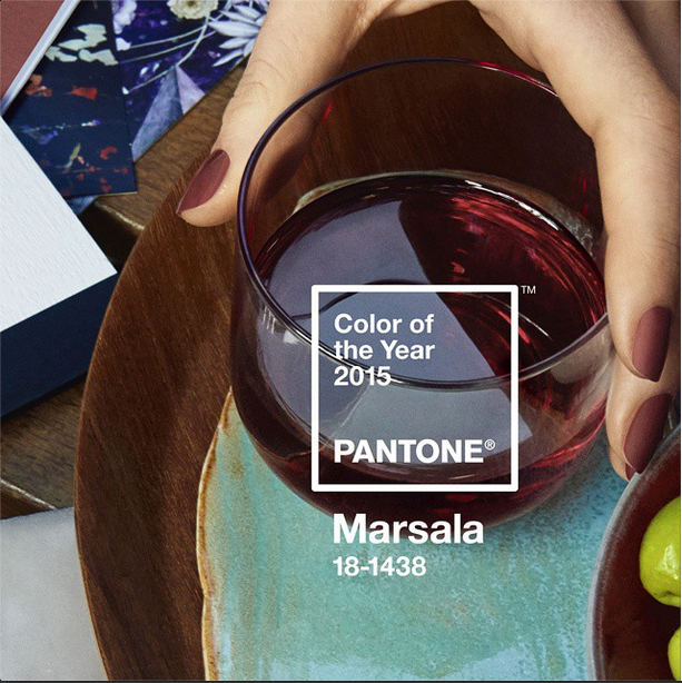
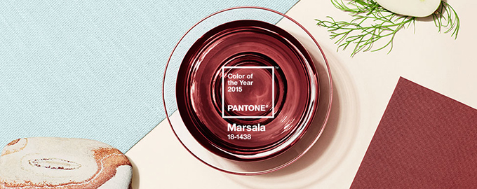
What time better than the start of a new year to share with you the ‘colours’ that made it to the hitless of two word players in the field of color. Pantone presented the colour Marsala (pantone 18-1438), a naturally robust, dramatic, luxurious warm and earthy wine red that enriches our mind, body and soul (in these hard and cold times we live in) as thé colour of 2015.
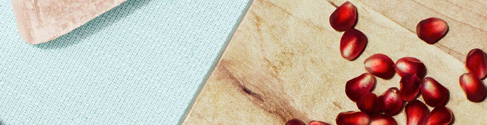
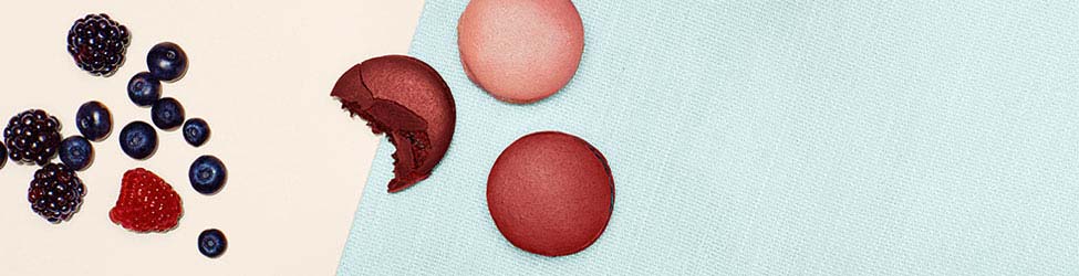
Marsala got it’s name from the fortified, tasteful and rich wine grounded in red-brown roots with a sophisticated, natural earthiness. Marsala combines perfectly with grey tones, sunny gold shades and taupe but also surprisingly well with today’s still very popular pastel shades.
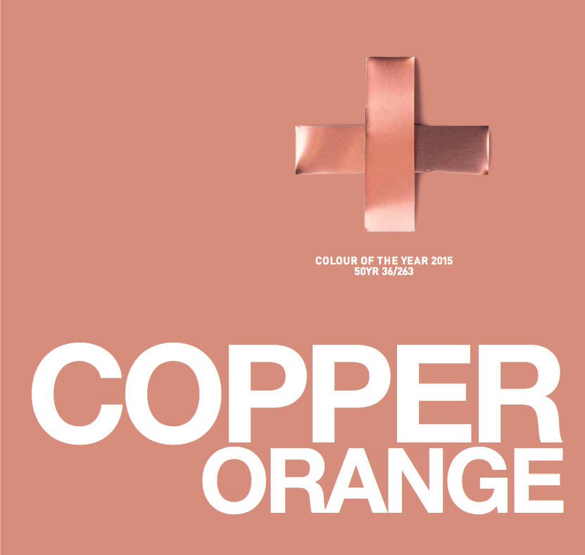
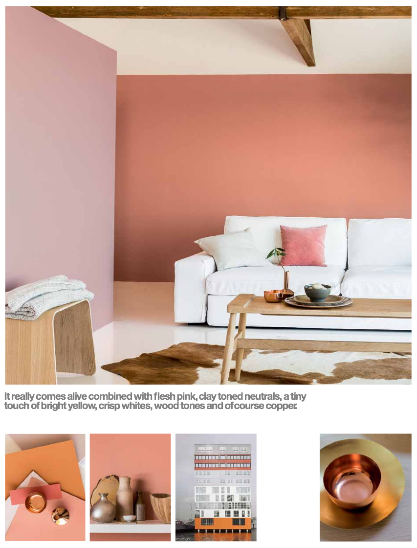
Another important player in the paint colour world market is AkzoNobel. In their ‘Colour Futures 2015’ report they launched their Colour of 2015: Copper Orange. As metallic colour tones are playing an increasingly important role in modern design, it’s not a surprise the upcoming design metal ‘copper’ inspired this color of the year. Great on its own, the color also combines perfectly with pinks, neutrals, whites and other orange hues, as well as with the other ‘color of the year’ Pantone’s Marsala!
Good to know, these two colours were selected by a team of international design- and color experts, after deep worldwide research. A lot of fashion, design and food industries will play with these colours in their future product innovations, so you’d better get used to them. Start experimenting at home and add at least one color of your own. Enjoy!
Later!
Kate

All images courtesy of Pantone and Akzo Nobel.